Modern Color
I’ve recently been trying to find non-screen based ways to find inspiring and/or just nice to look at photographs, and to that end I’ve been buying one photography book and a small number of zines each month as lock-down continues. Whilst I’m not going to review them all, I will recommend my favourites here, starting with Modern Color, a look back at the photography of Fred Herzog.
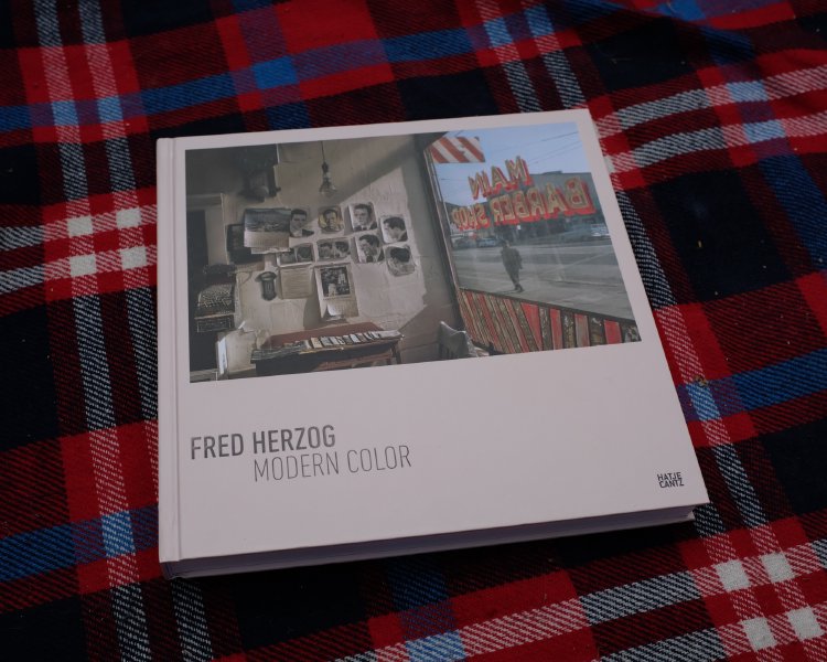
I’d not heard of Fred Herzog before reading this book, so don’t feel bad if it a new name to you too; my understanding is that his work wasn’t very appreciated at the time and is only gaining notice of late. In part because he chose to work in colour back when photography was only considered art if you used black and white. Fred Herzog takes what I’d describe as street photography without people, capturing city life (mostly in his home town of Vancouver) of the 50s and 60s but with the city as the subject rather than any individual people living there.
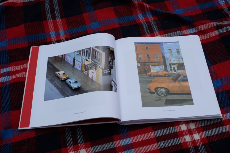
There is a current vogue, which I must confess to rather like, for pictures of the remains of old buildings from this same era, particularly along route 66 and the like (e.g., Kat Swansey or Kyle McDougall, just to pick some examples from the K’s). I guess it’s a mix of the wonderful visual design elements whilst also telling a story about how things don’t last. But if those photos tell the end of the tail, Fred Herzog captured its birth in these pictures. It was that modern world being created: tower blocks settling in amongst the wooden buildings that came before, the shiny sleek modern cars, neon signs everywhere.
The images themselves certainly stand on their own in terms of composition and use of colour - I like the images as images themselves. Whilst a few do feel a bit snap-shot-ish, most have a strong sense of there being a point to what Herzog was trying to capture as he walked about his city: somewhere in each picture there is a juxtaposition or strong visual element to make it interesting. But as the book title hints, here’s more to these photos than this.
It’s rare those of us who didn’t like through the era to get to see it without the filter of black and white making it immediately of another time: distant and distinct. Here in colour the world is much more relatable to modern day, encouraging you to spend more time looking at the details that make the world of the 50s and 60s different from the world of today, or instead to reflect on the similarities that indicate we haven’t come as far from that world as we oftentimes might think.
Some scenes, such as this picture from 1960, could easily have been shot today, such is the timeless nature of certain aspects of our cities:
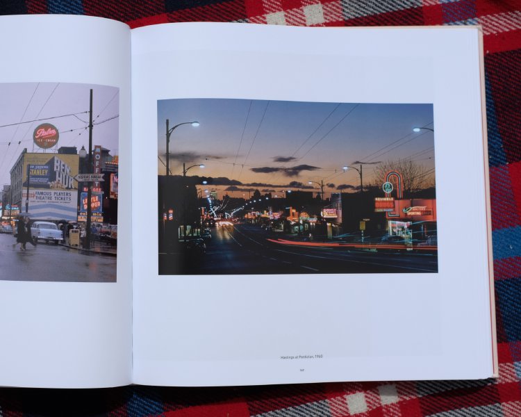
And that I think is why I like this book so much: not only are the pictures aesthetically pleasing and pop thanks to the inclusion of colour, but they really do encourage you to engage with them rather than just immediately write them off as here’s how things used to be.
- Next: Dithered
- Previous: Hugo Is Boss
- Tags: books, Photography